Did you know that the product page is the most neglected part of the sales funnel?
Yes, funny enough most people look to change their cart appearance, check out page, and website colors before they even consider editing their product pages. This could be because they are intimidated by the sheer amount of editing that needs to be done depending on the product assortment and that is fair.
However, the product page is one of the most critical parts of the e-commerce website because it is where your page views convert into sales.
Product pages tell your customers why they need to purchase your product. They should go beyond product descriptions and quality images.
Want to know what you can do to take your product page to the next level? Continue reading for some tried and true ideas.
1. Don’t Bury the Lead
If you’re in journalism, you know exactly what this phrase means. Don’t make people dig for what they want. That’s true for the news cycle and especially true for online retailers.
Displaying the product effectively and letting the customer exactly why they need it is the only way that you’re going to guarantee that a customer will stay on your site long enough to make a purchase.

Do not leave the customer wanting more. Remember, all they have to do is click the back button, and you have lost a sale.
Avoid all of that by showing a clear image of what your product is, and provide a summary of the product and include what the product is composed of.
PROTIP
Use the space in the product page to cover why your customer needs it in their life. All formatting should be easy to follow.
You can even capitalize on certain factors by bolding keywords. You want your customers to be able to recognize the essential information while they glance through your product page.
2. Address Your Customer’s Concerns
Regardless of how much your customer wants your product, there are still questions they have and want to speak to someone about before purchasing.
It’s your job to make sure all those questions receive an answer.
When customers are shopping for hair extensions some key questions that they ask are:
- What is the grade of the hair?
- How does that grade translate to quality?
- How much processing can each grade of hair take?
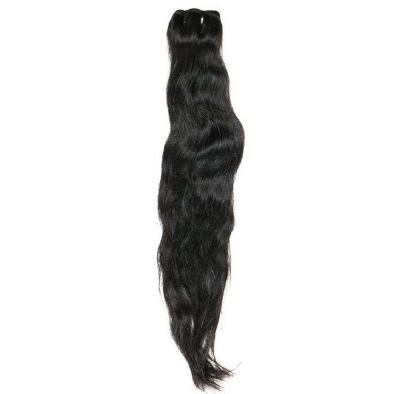
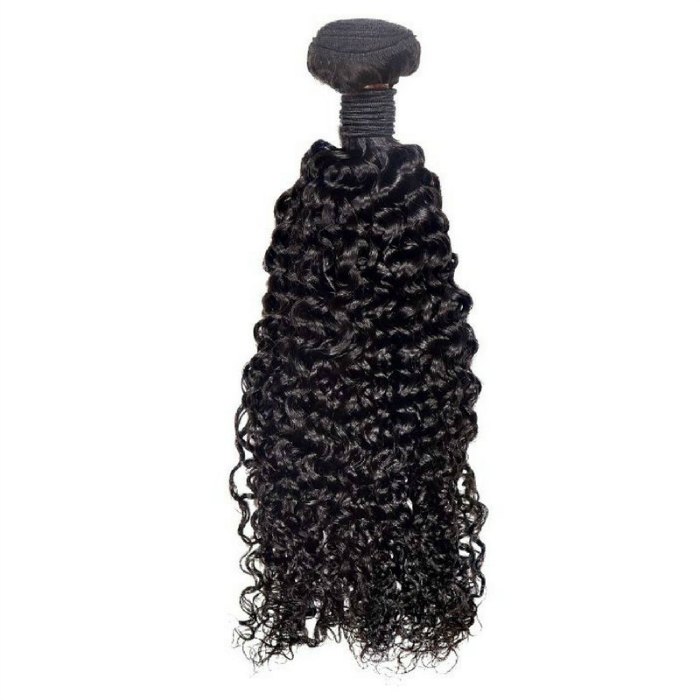
You can show the look of the hair extension bundle through a high-quality photograph.
Allow your customer to zoom in on the different raw and processed textures so that they can see the difference between Brazilian and Malaysian ethnicities. Enable your customer to view multiple images of each type of hair and use one of those images to display copy about the hair.
For instance, If it’s Brazilian hair focus on the 8A grade and its ability to be dyed to a 613 Russian blonde color without immense shedding.
Let your customer know that this means they can purchase this hair and manipulate it to match their hair color without investing in the more expensive raw hair also available.
Having a copy available for them that compares raw textures vs. processed textures will help them to make an informed decision and set their expectations for the product before they buy it.
Expectations and knowledge will lead to fewer returns and customer complaints!
PROTIP
Be price point conscious and help your customer see the value in the purchase.
While your customer wants to look good, they do not want to break the bank. If you are mindful of that and their motivations you can secure a sale quicker.
3. Make a Call to Action
While upgrading everything about your product page don’t forget to make sure you can easily add the product to your cart. Guarantee that your customer sees that they can buy the product right away.
These buttons should go with the design of your page, your product images, and your overall layout. It’s just most important that you make sure it is visible.
PROTIP
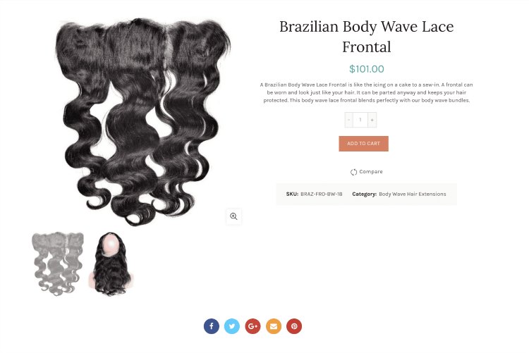
Your button should use simple language. Don’t get cute and confusing. This isn’t signing up for a newsletter. This is completing a sale. A simple “Add to Cart” will suffice.
4. Live Chat
No matter how much information you leave on your page, people are always going to want some confirmation. This is why live chat comes highly recommended as being one of the best ways to speak to a customer, fast.
Customers like it because they can get their answers as soon as they need them and can still multitask online. It shows that you value their inquiries and they feel like they’re not really losing any time.
Live Chat is a feature similar to an FAQ page but with interaction. It makes it easier for Customers to decide because they are speaking to knowledgeable employees or yourself about your product.
However, Live Chat is something you have to be strategic about because it is a conversation. You do not need it slowing down your employees all of the time.
We recommend using your best judgment when implementing it.
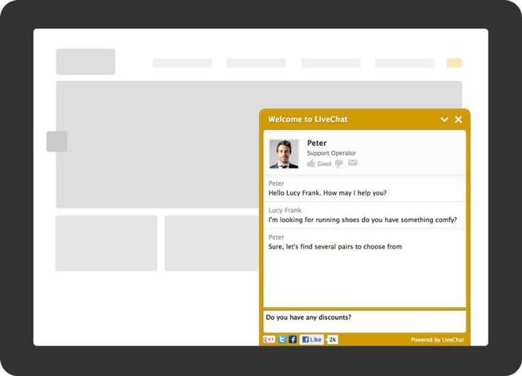
If you are doing something like a flash sale and it requires you to rid yourself of a lot of inventory or take advantage of a sale opportunity, use Live Chat.
Think of Live Chat as a tool that you can close as many sales as possible. You can also use it on specific product pages.
For example, if you have a new product that comes out you might want to enable Live Chat So that you can capitalize on the newness of the item and answer a lot of questions quickly.
Live Chat is also a great way to let your customers know that you are accessible as a company. They can visibly see that you are available to them and you are and not going to run off with their money.
Even if your Live Chat isn’t active, for someone to see that you do have it on your site, it will give them a sense of ease and reliability.
Protip(s):
Remember if a customer is using live chat this is your way to close a sale. You don’t have to be too sales-y. If they are asking you, they are already halfway there. You just have to be helpful and transparent with your answers.
Do not add Live Chat to your website if it comprises the speed of your site.
5. Maintain Your Site’s Load Speed

That last pro tip flows into this next piece of advice flawlessly.
In today’s society of instant coffee, instant oatmeal, and instant gratification no one has time to wait for your website to load.
Reports say that a one-second delay can result in a 3.5% decrease in your conversion rates. We are not trying to leave any money left on the table, so you need to make sure that your product pages are loading almost instantaneously.
Note: If you’re noticing any issues with your website be sure to contact us immediately so that we can address that for you! We want to ensure that your customers are having an efficient and speedy online shopping experience.
6. Videos and Gifs
One of those really sucky things about online shopping is that you can’t see, feel, or try on a product in person. This is important when it comes to hair extensions because a lot of people want to see if the hair extensions will match their leave out.
Because of this issue visuals are essential to the online shopping experience. As a hair business, you need to do all of the work required for your customer to in vision the hair on their head.
We talked about high-quality images earlier, but that’s not the only way that you can communicate. Visuals are not just limited to still images.
Videos, another way that you can show your customers all of the qualities that your hair has. Videos work with edge control and lashes as well.
Showing product videos of how to apply edge control, its consistency coming out of the jar, and how much to apply to your edges will sell your customer on its effectiveness.
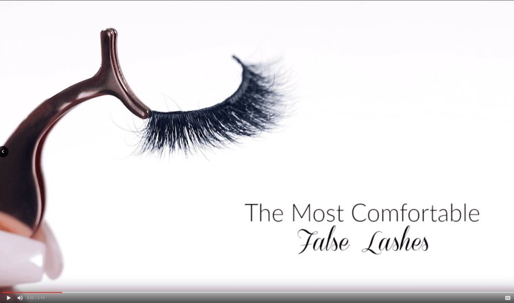
Showing your individual lash styles up close will differentiate the styles, and show your customer how full and or spaced out each pair is.
For the videos to be worthwhile, you want to be able to show your customers what they would see in person. Zoom in on the differences between thick line and thin line lashes so that your customer knows what they are working with when it comes to their final look.
Answering these different questions before they someone can think to ask is always helpful.
Pro tip:
Product videos can be short and sweet they do not need to have audio, and you don’t have to put too many resources into it. Fancy backdrops are unnecessary.
Just make sure your product is in a well-lit area, and you can film from all angles.
Remember, a video is getting you something that a group of images can not. You want to bridge the gap between the in store and the online experience.
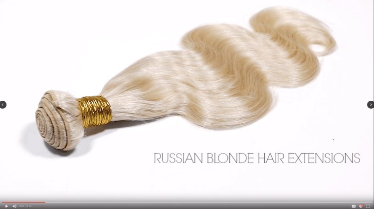
Your product videos should always answer these two questions:
If your customers were buying this product in person, what would they closely examine?
What would they want to see and compare?
Even though your product videos are for your website’s product pages, they can also be used to promote your brand as a whole. Meaning, you can always reuse these videos on social media, and other blogs are websites that you’re reaching out to for promotion.
7. Capture Reviews
Another feature that your product page should have: a review section.
When your product enables a customer to have a pleasant experience or make someone feel good, they want to leave a testimonial.

If you leave a section for each product to display customer reviews, you will be giving your customer a voice when it comes to your brand. And you will also be establishing trust between your company and its potential customers that come in looking for product recommendations.
Did you know that Nearly 95% of shoppers read reviews before making a purchase? Yes! 95% So use this to promote your products and do the selling for you.
Naturally, as a customer, you would trust other customers before trusting the actual company site. Social proof is capital.
Pro tip:

If your customer hasn’t left you a review right away feel free to follow up with up them and ask for one.
After, be sure to give them a thank you, a shoutout on social media, or a coupon so that they come back to you regardless of their experience. Honor them with loyalty, and they will give you more business.
Additionally, ask customers for honest reviews only!
Reviews and testimonies like this will hit hard because the products a hair business provides transforms the appearance of your customers.
Something like that can affect someone’s self-esteem, so you want to share their stories and spread that feel good feeling to people who may not have purchased from you but are looking to.
8. Boost Confidence with Social Proof & Guarantees
If your business won any awards in your city or a prominent news outlet has given it a review, let your customers know that immediately. A picture of a banner on the product image or mention of the accolade in the product description automatically makes customer reviews less critical.
Think of it as a little bit of a shortcut to establishing social proof.
If you do not have any official accolades, you can also make your badges and incorporate them into your product page.
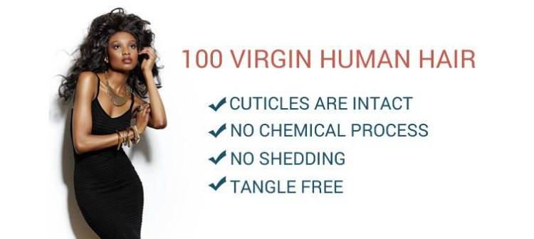
Things like “Imported from Vietnam” or “Raw Indian” would be great banners to put on your product images for the raw hair that you offer.
It goes a long way and probably a little longer than the bullet points that would be in your product description. Think of it as providing your customers with a visual summary.
Returns
You can also give your customer solid guarantees on your product page. Do this by communicating your return policy under each product.
Furthermore, provide your customers with a customer satisfaction guarantee that enables them the ability to swap something out if they don’t like it, or get some compensation if a product does not meet their expectations.
You do not want these things to be hidden because they put your customers at ease. It shows that your products are reliable and something that can be trusted.
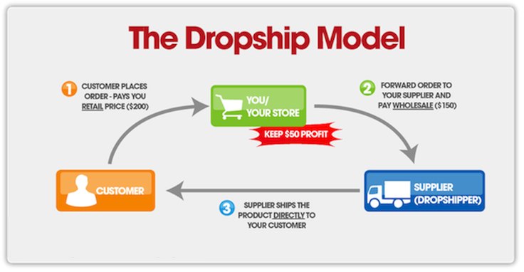
If you are a dropship customer, your return policy needs to be in line with the Dropship Bundles Return Policy so that we can adequately service your customer.
DSB Return Policy:
We offer a 100% Satisfaction Guarantee on our products. If you receive your hair extensions and are not happy how they look or feel you may return them to us for your money back minus shipping if applicable.
Hair must be in the original state the same as it was sent to you. Any hair extensions that have been altered, washed or worn in any way will not qualify to be returned.
We honor this for up to 30 days after purchase(30 days = date package left our facility to date return is received). Orders returned after 30 days will be sent back at customer’s expense or customers will be given online credit only.

Pro tip:
With products in the beauty industry, it is tough to give a money back guarantee due to hygienic reasons. Do what you can and what’s possible for your products display that so that there is no confusion as to what your customer can do if they do not like what they purchased.
9. Up sell
The product page is where you should have all the information about your product.
However, remember that its goal is not to inform for the sake of informing. You are providing information to sell your customers on your merchandise!
With that in mind, please remember that a lot of sales can be lost by you cramming additional details on your product pages. This includes links to other products.
People do not want to be oversold.
Up selling and cross-selling is a good thing, and if done correctly can enable you to increase your order value average.
However, You need to do it in moderation. And be organized when executing the look of your product page. Do not add too many banners on your product page. Advertising something other than what your customers focus on at the moment can confuse them and cause them to freeze up when pursuing their wants.
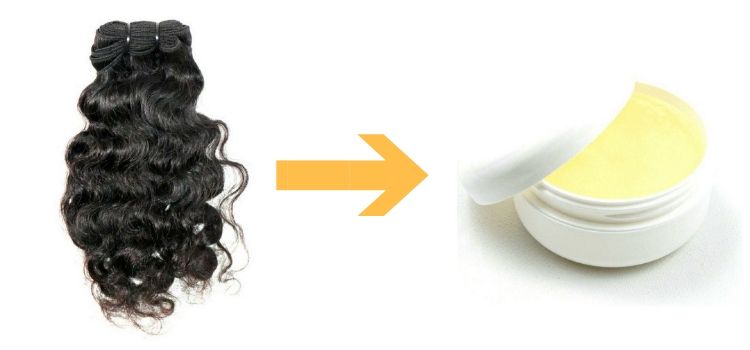
An excellent way to cross-sell or upsell to your customers would be to add complementary products to the banners on the side of the site.
For example, if your customer is looking at Indian Curly hair, you can offer them edge control to complement the style or a new Indian closure to complete their look.
Do not confuse them by showing them pictures of other curly hair textures. Next to these additional products you can incentivize your customers with a free shipping link after spending a preset minimum amount and a guarantee like stress-free exchanges!
10. Stay Stocked
Sold out is a good thing. At the same time, it can also cause you to lose a sale.
There have been plenty of times when our Dubai or Grace lashes have left the shelves and taken a few weeks to replenish. That’s just the nature of the game when you are dealing with orders coming from overseas and the beast that is customs.
To avoid losing that sale and that customer forever, make sure you capture that potential customer’s information. Then you can contact them when that product does become available again. The goal is not to let any likely sale slip through your fingers.
Create a Product Page that Sells

You want your customers online shopping experience to be as stress-free as possible. Do this by upgrading and optimizing your product page with small additions to get them from your website home page to your check out page!
A perfectly executed product page can set you apart from the competition and make sure that you don’t need any money on the table.
How have you implemented different ideas to upgrade your product page? We would love to know in the comments below!

